Taking Language Apps to the Next Level
Some of the most satisfying changes to an app happen between the bigger features: an illustration that gives a word a visual association, a character that brings a little warmth to onboarding, or an icon that feels at home beside the others. I’ve been spending time on those details across san serif’s language apps, using ChatGPT to explore the artwork and Codex to help bring it into place.
Illustrated Flashcards
Tsugi is a Japanese dictionary and study app. For its vocabulary flashcards, I wanted illustrations that could give a word a clear visual cue. A concrete noun might need one recognisable object. A verb needs an action. An abstract word needs a scene that makes sense beside its definition.
I generated the illustrations with ChatGPT. In the new flashcard layout, the Japanese sentence stays on the front. Flipping the card reveals the word’s definition, its illustration, and the English sentence. The image gives the answer a visual cue without giving it away before the flip.
数が多いので、時間がかかります。
kazu ga ooi node, jikan ga kakarimasu.
number
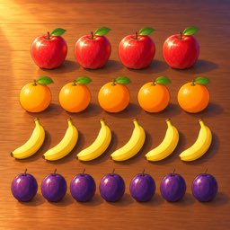
There are many, so it takes time.
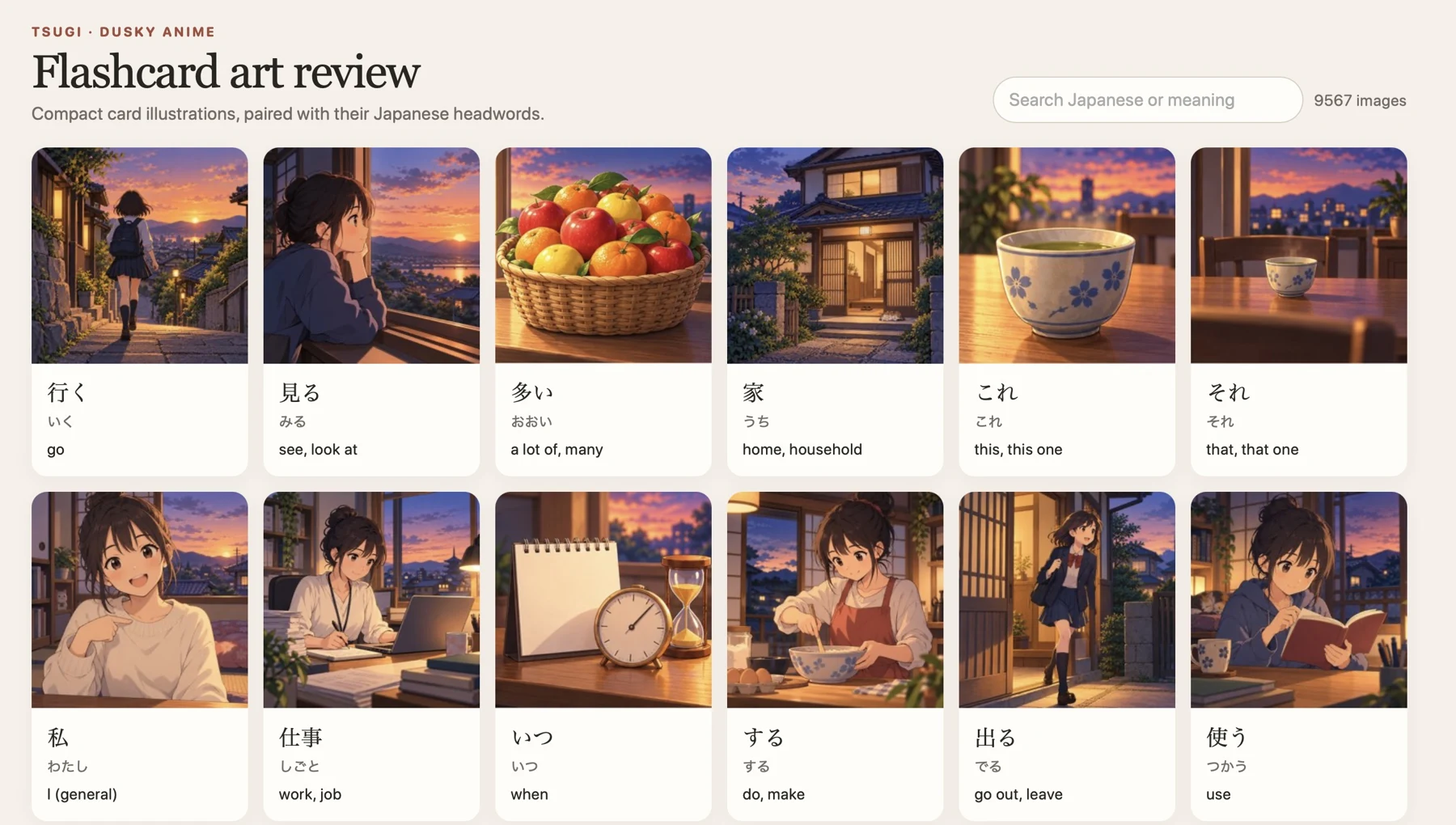
Codex helped build the workflow around the images: an art guide, manifests that track vocabulary IDs and progress, scripts for packaging batches, and a browser gallery pairing each illustration with its Japanese word, reading, and English meaning.
I can search and compare related entries, spot images that need another pass, and refresh the gallery after replacing an asset. Some illustrations drifted towards photorealism, so I added a style reference and guidance for a consistent 2D anime finish and a clear focal idea.
Mascots for onboarding and paywalls
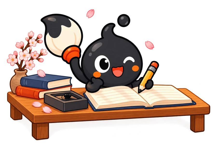
For Kaku, a Japanese notes app, the artwork includes an ink mascot with a brush. For Sajeon, a Korean dictionary, it includes a magpie. These characters give the apps a warmer visual identity and appear in the onboarding and upgrade experience, alongside the explanations of what each app can do.
 Kaku · Study
 Kaku · Listening
 Sajeon · Welcome
 Sajeon · Listening
I used Codex to develop character variations for welcoming, listening, studying, and celebrating. Kaku’s study and listening illustrations and Sajeon’s magpie appear in onboarding; the magpie also waves from Sajeon’s paywall. Reviewing each character as a set helps keep its appearance consistent and leaves room for screen text.
One icon family for three watch apps
For the Japanese, Korean, and Chinese vocabulary apps for Apple Watch, TokeiTango, Eohwi, and Zungzi, I wanted each icon to have its own identity while still belonging to one family. Codex helped me explore a shared composition with distinct characters, landmarks, and palettes.
 TokeiTango
 Eohwi
 Zungzi
Each icon pairs a language character with a landmark: と with Mount Fuji, 어 with Gyeongbokgung (경복궁), and 字 with the Great Wall.
On the Horizon
The flashcard illustrations have left me wondering where else a visual approach might help. Words with similar meanings can be difficult to separate through definitions alone; a pair of scenes might make the distinction easier to grasp. Grammar offers another possibility. A change in perspective or the relationship between two people might be easier to follow when there’s something to look at alongside the explanation.
These are still possibilities, but working with Codex has made them feel close enough to explore. I can start with a small example, see how it works in the app, and learn whether it deserves to go further. There’s something exciting about being able to follow a thought that far while the curiosity is still fresh.
As the tools improve, I wonder how much more of that exploration will become practical for a developer working independently. These apps give me somewhere to find out, with real vocabulary, real learning difficulties, and people who can tell me whether a change helps. I’m looking forward to seeing what grows from that, and sharing what I learn along the way.